Naming and positioning a new consultancy with big ambitions
The consultancy that sees things differently
When one of our most entrepreneurial clients decided to set up a new kind of business consultancy, they asked us to work on the brand. The vision was to blend data analytics, heavy hitting leadership experience and strategic investment, to help established SMEs shift gear, scale up and grow.
The founding team had all started businesses, built them and sold them, so they understood the need for good data, strong instincts and a healthy mix of expertise and perspectives. They were also determined not to shout from the sidelines, but to stand side by side with business owners, taking interim executive roles and backing their advice with investments of their own money.
The new consultancy needed a sophisticated brand with a human feel. Even though data and technology would play a big part, the team’s combination of experience and skills and their commitment to building strong relationships would be the key.
We looked at the competitive sector, workshopped with the partners and talked to their launch clients. An intriguing idea emerged. Something about the combination of analytics and the mix of lived experience meant that the team where somehow able to see their clients’ companies in a different way. They could see opportunities for growth or sale that others couldn’t.
It reminded us of the phenomenon of impossible colours. Research suggests that there are some mysterious colours that sit between the standard tones of the spectrum. They are invisible to most people but, apparently, there are some with particularly sensitive vision who are able to see them. One of these impossible colours is charmingly known as Reddish Green.
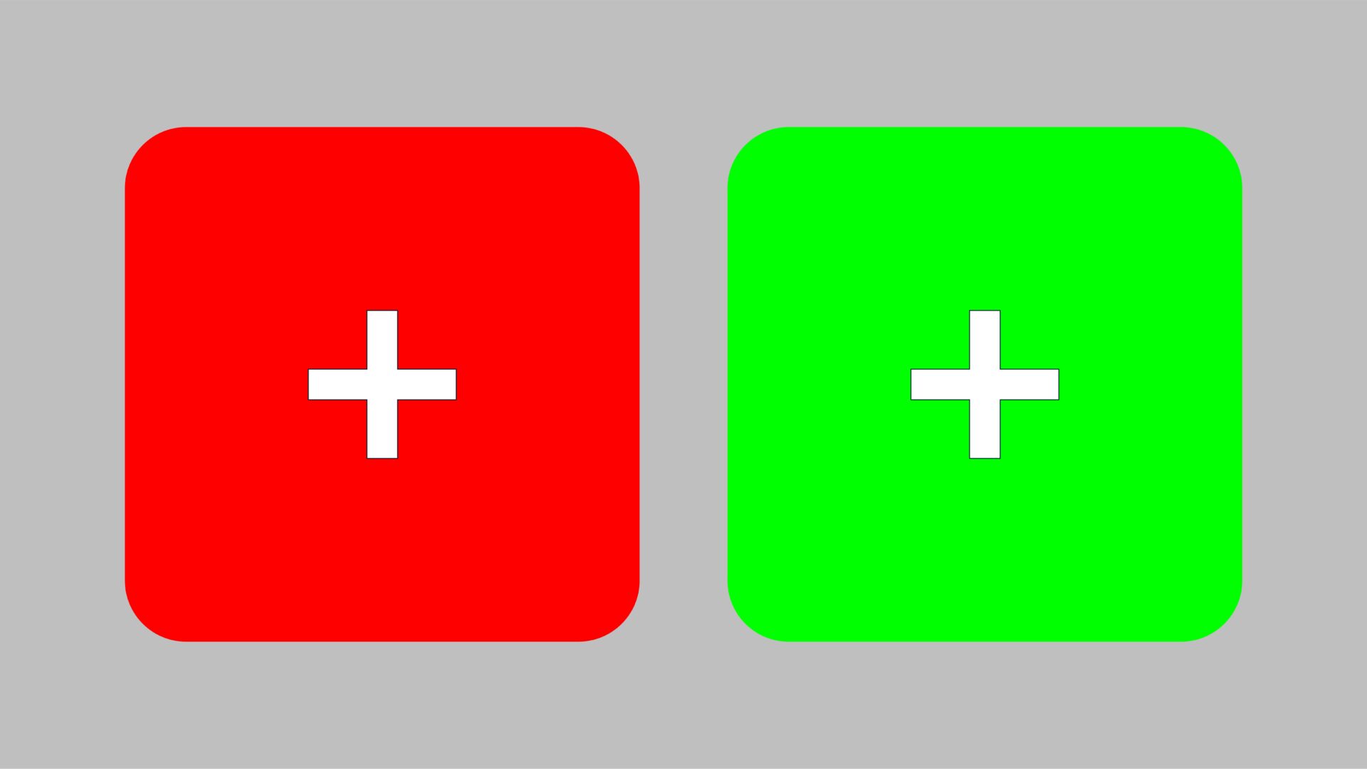
You can find out whether you’re one of the special people who can see Reddish Green using this test image above. Let your eyes cross so that the plus symbols are on top of each other. If a colour appears that isn’t red or green but something mysteriously different, then congratulations.
We really liked the back story and the quirky feel of the phrase. We also liked how it sounded a bit like an old school consultancy business, named after its partners, Reddish and Green. Our client agreed. So, we turned the phrase into a single word, did a linguistics check and applied for the trademark.
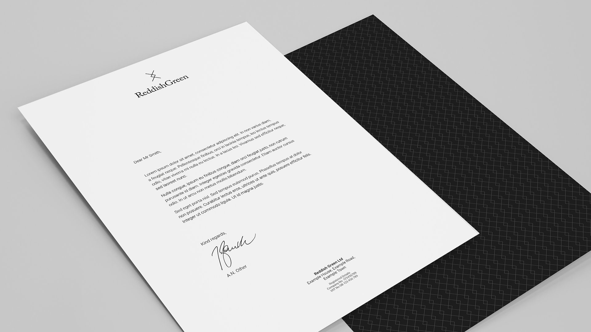
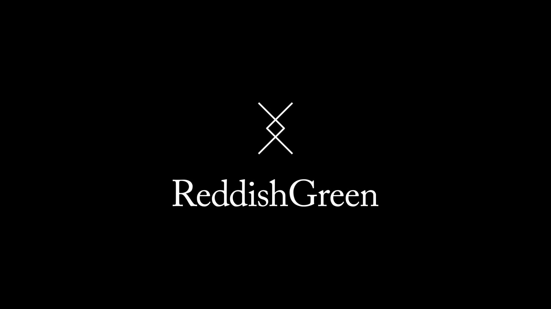
The next step was to create a simple, confident visual identity and a set of high-end presentation materials and corporate stationery. We designed the look and feel like a couture brand, with a restrained type mark and icon crest. We kept the colour palette locked to black and white only. No blueish yellows or reddish greens.